Welcoming the New Year with a Fresh Start
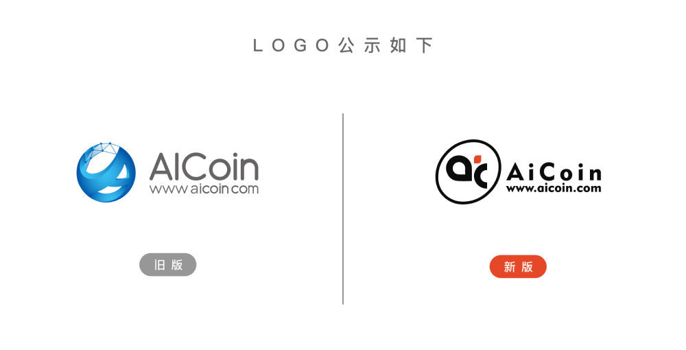
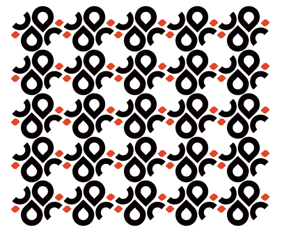
The new AICoin logo represents a transformation of the brand, rejuvenating both its visual and core identity. The new logo draws inspiration from the letters "A" and "C," incorporating vibrant orange accents that evoke a sense of dynamism for the future within a minimalist geometric design. The orange square resembles a spark of energy, igniting the power of innovation while adding a touch of warmth and emotional resonance. The lines are smooth and flowing, with a stark black-and-white contrast, creating a rhythm within simplicity.
From "Form" to "Meaning": AICoin's Comprehensive Evolution!
Our new logo is not just a visual refresh; it is an upgrade and redefinition of AICoin's core identity. This design is inspired by the core letter "A" of AICoin, utilizing a deep understanding and creative extension of the letter to combine lines and modules, creating a new image that is both minimalist and technologically sophisticated.
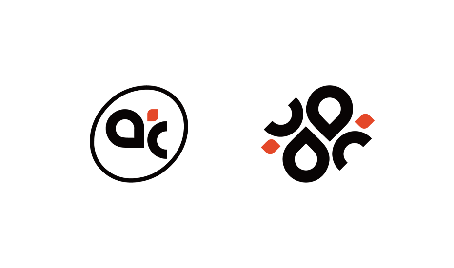
The foundational design inspiration for the logo comes from the upward shape of a droplet, perfectly merging with the letter "A." The droplet symbolizes life, hope, and inclusivity, while its upward posture conveys AICoin's relentless pursuit of excellence and continuous progress. Each curve is dynamic and powerful, representing the lifeblood of AICoin's development, symbolizing the harmonious unity between nature and growth. The dynamic presentation of these design elements not only showcases AICoin's agile characteristics but also conveys our vibrant outlook for the future.
The orange accents are the soul of the entire design. They act like jumping sparks, infusing warmth and vitality into the overall design, symbolizing wealth accumulation and positive energy. Orange is not only a visual highlight but also an emotional bridge that connects AICoin with users through trust and emotional resonance. Through the application of orange, we hope to convey AICoin's warmth, tightly linking technology with humanity, and blending innovation with warmth.
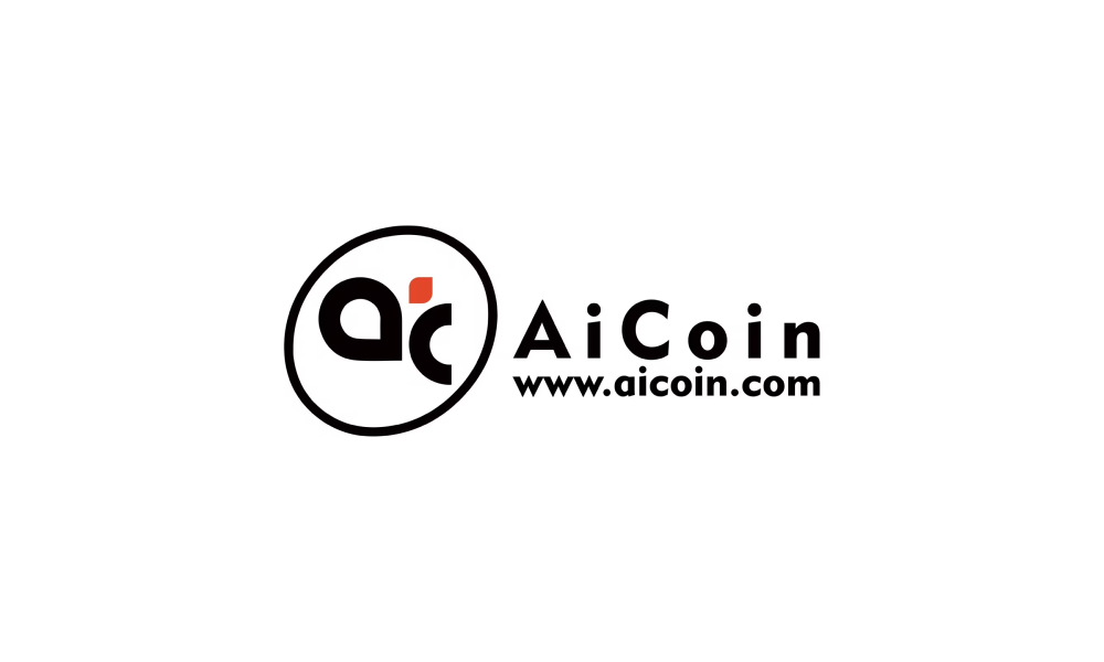
This logo update also incorporates the concept of "the wind is rising," using rhythmic design language to convey AICoin's momentum in the current era. The flowing curves symbolize AICoin's journey of setting sail with the wind and adapting to circumstances, while also showcasing AICoin's limitless imagination and creativity for the future. This combination of dynamic and static design philosophy reflects AICoin's inherent stability and breakthroughs, as well as our belief in embracing change and leading trends.
Behind the Logo: A New Chapter for AICoin
This is not just a change in image; it is an important milestone for AICoin as we step into a new phase. In the past, AICoin has grown through accumulation and sedimentation, and now we choose to embark on a new journey with our new logo. This reflects AICoin's profound self-reflection on its positioning and represents a comprehensive elevation from visual symbols to brand spirit.
Droplets, curves, orange, rhythm… these seemingly simple elements embody the symbiotic relationship between AICoin, the times, and its users. Our new logo carries the past and future of AICoin, conveying our beliefs in innovation, growth, and inclusivity, while also expressing our determination to embrace the future together with every user.
In the days to come, the new logo will accompany us as we rise with the wind, writing a new chapter that belongs to both of us in the waves of the times! Let us together illuminate a more exciting future through innovation and warmth!
免责声明:本文章仅代表作者个人观点,不代表本平台的立场和观点。本文章仅供信息分享,不构成对任何人的任何投资建议。用户与作者之间的任何争议,与本平台无关。如网页中刊载的文章或图片涉及侵权,请提供相关的权利证明和身份证明发送邮件到support@aicoin.com,本平台相关工作人员将会进行核查。
