It is not difficult to know, but it is not easy to do. For investment in the secondary market, everyone knows that they should not be greedy, nor should they chase after rising and falling prices. However, how many people can control their own hands to achieve the integration of knowledge and action? In the Tao Te Ching, Laozi mentioned Dao, Fa, and Shu. Dao refers to rules, natural laws, core concepts, Fa refers to methods, legal principles, systems, and Shu refers to behavior, operational methods. The combination of Dao, Fa, and Shu is considered an important principle and criterion guiding people's lives and social development.
For the secondary market, we can also divide investment into Dao, Fa, and Shu, and none of the three can be lacking.
Dao: Represents investment concepts and beliefs, that is, the direction, goals, and values of investment. This includes analysis of long-term market trends, macro conditions, and fundamentals.
Fa: Represents investment rules and regulations, including investment strategies, risk management, and asset allocation.
Shu: Represents technical analysis, quantitative analysis, and trading psychology.
Today, this report will focus on "Shu" in trading, with the aim of sharing the application of technical indicators and technical analysis in actual combat. For the vast majority of people, there is no need to learn many obscure technical indicators because technical indicators are lagging and cannot directly generate profits. This report will share commonly used methods of technical indicators to let more people understand the significance of technical analysis.
Disclaimer: The currencies and indicators mentioned in this report do not constitute investment advice, and are for learning purposes only. The investment advice and indicator usage mentioned do not apply to all currencies and products. Blockchain carries extremely high risks, and you may lose all your principal. Please do your own research.
The article mainly includes:
I. Explanation and Application of MA and MACD Indicators
II. Explanation and Application of Boll and RSI Indicators
III. Pennant Pattern Variations
IV. Conclusion
I. Explanation and Application of MA Moving Average Indicators
The MA indicator, also known as Moving Average, calculates the average price within a certain number of periods. For example, for MA5, this represents the average price of the candlestick chart for 5 time periods (including the current one), regardless of whether it is on a minute, hourly, or daily level. The smaller the MA number, the more sensitive to fluctuations, thus focusing more on short-term fluctuations, while a larger MA number indicates slower fluctuations, focusing more on long-term fluctuations.
The MA numbers are set according to the user's preference. Here, I will share two sets of MA trading methods that I commonly use, namely the Vegas Channel and the Squeeze Channel.
Vegas Channel
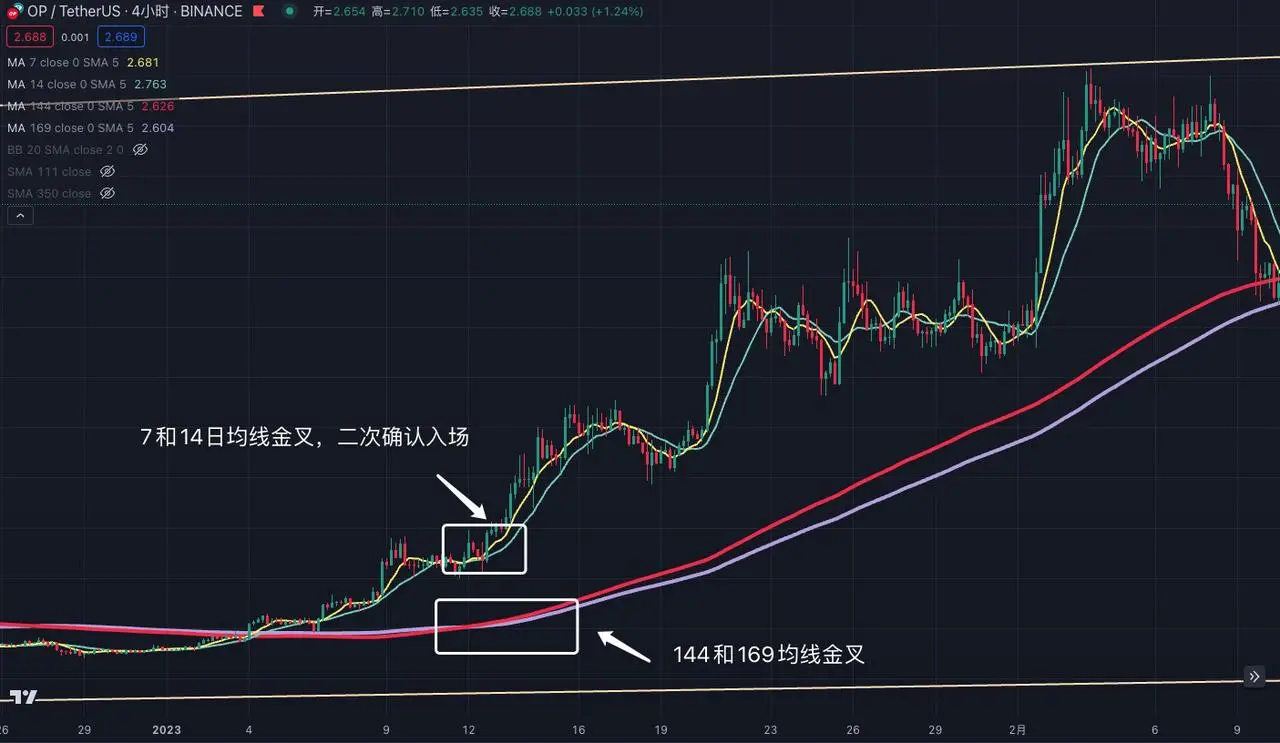
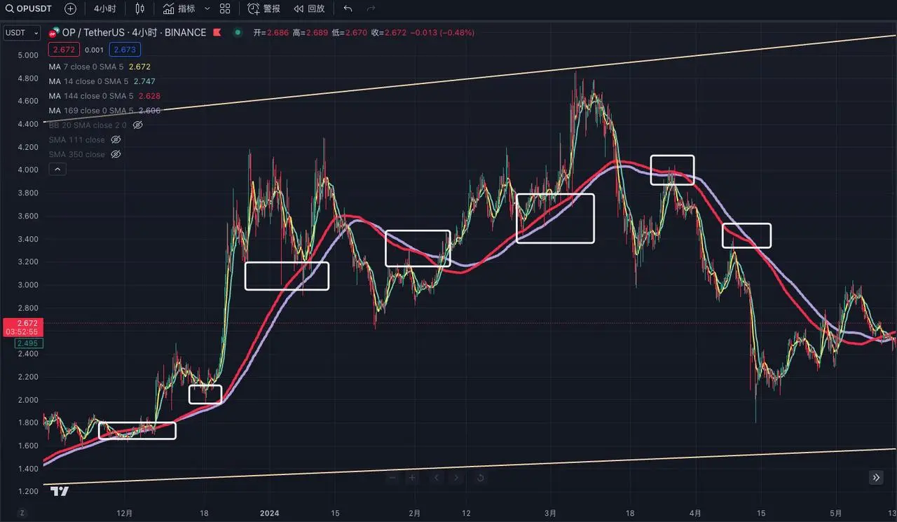
The Vegas Channel, in simplified terms, uses the 144 and 169 moving averages to judge medium to long-term trends. This method is not suitable for periods shorter than 15 minutes and is suitable for use on periods longer than 1 hour.
Why use these two moving averages?
Upon careful observation, we can see that 144 and 169 are respectively the squares of 12 and 13, with the principle implying Gann's square theory and the Fibonacci sequence. That is, the number 144 comes from Gann's square theory, and the number 169 is the square of the Fibonacci sequence number 13. Only when combined can they have a better application effect in actual combat.
Example explanation:
Taking the 4-hour trend of OP as an example, when the 144-day moving average crosses above the 169-day moving average, a golden cross (indicating the 144 moving average crossing above the 169 moving average) is formed, representing a bullish medium to long-term view, and one can consider entering the market. When the price reaches the top, and the 144 moving average crosses below the 169 moving average, forming a death cross (indicating the 144 moving average crossing below the 169 moving average), it is time to exit and observe the medium to long-term trend.
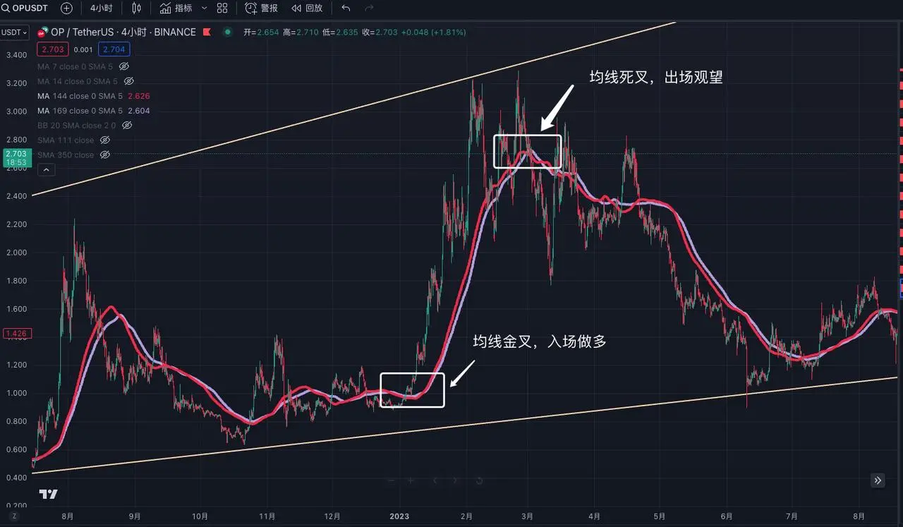
Now, someone may ask, you are being too absolute in your statement, how do you explain the back and forth crosses of the moving averages before the consolidation? You are just gambling!
My suggestion here is that since the 144 and 169 moving averages cannot judge short-term trends, and have a strong lagging effect, you can add the 7 and 14-day moving averages on this basis to assist in judging short-term trends. Let's zoom in on the trend of OP, judge the medium to long-term market changes through the larger time frame MA moving averages, and then use the golden cross of the smaller time frame MA moving averages for secondary confirmation, which can maximize certainty.
The Vegas Channel is used to judge medium to long-term trends. Due to the lagging nature of the Vegas Channel, it still needs to be supplemented with short-term moving averages for verification. A strong market trend must have the 144 and 169 moving averages rising. If the price consolidates near the 144 and 169 moving averages, it indicates a weaker short-term market and is not suitable for entry. At the same time, the 144 and 169 moving averages have good support and resistance effects, suitable for ultra-short-term oversold rebound operations, etc.
Squeeze Channel
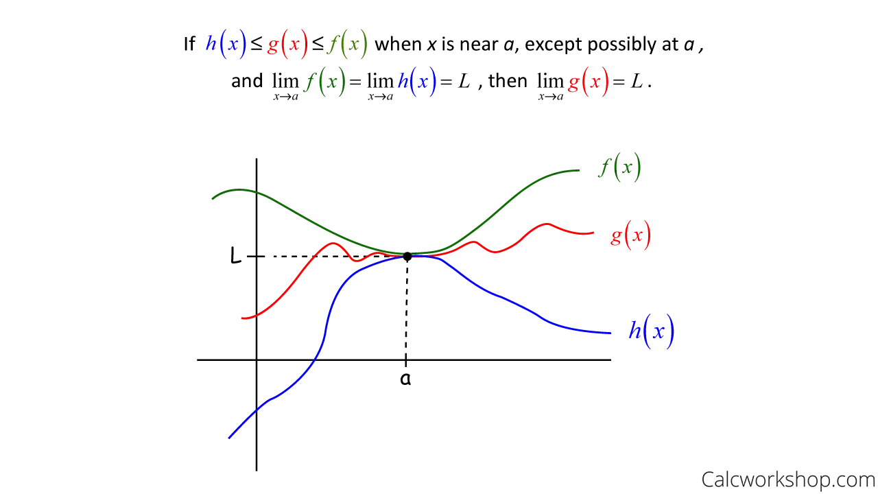
The Squeeze Channel is mainly derived from the Squeeze Theorem in mathematical calculus, which simplifies to, if a function is "squeezed" by two other functions near a point, and the limits of these two functions are the same, then the limit of this function will also tend to the same value.
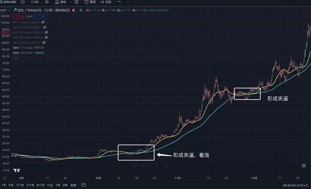
In secondary market trading, we can also use a similar Squeeze Theorem model. We can simplify it to two moving averages, namely the 111 and 350 moving averages. Since the period of the 350 moving average is longer, it is recommended for use in short-term trading.
Why these two moving averages?
When the 350 and 111 moving averages are divided, the number we get is closest to the value of pi, approximately 3.15, or if we divide 350 by 3.14, the closest number we get is 111.
Example explanation:
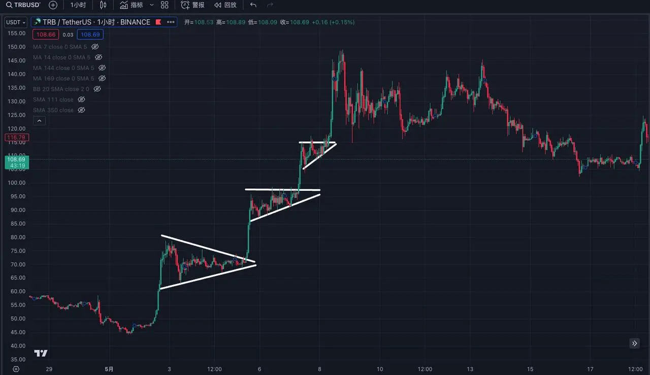
Taking the 1-hour trend of TRB as an example, when the blue line (350) moving average is above, and the yellow line (111) moving average is below, forming a triangular shape or a similar shape, it represents a successful "squeeze." After the success, the subsequent trend is bullish. However, it is important to note that for a correct "squeeze" pattern, the 111 moving average must cross the 350 moving average. If only one side crosses, it is not valid.
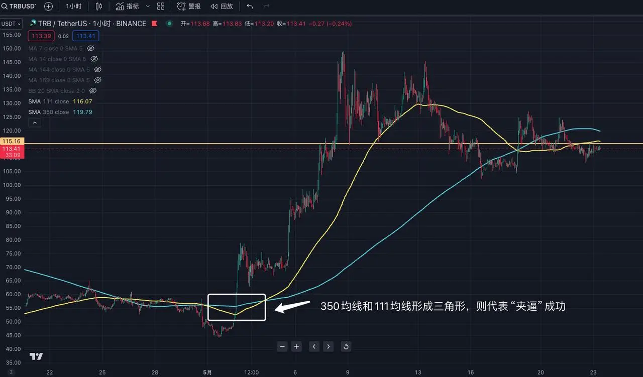
This channel is suitable for 1-hour and 4-hour periods, with average accuracy. However, once successful, the subsequent trend will be of an extremely large scale, so when a squeeze pattern appears, it should be closely monitored. Other technical indicators can also be used for auxiliary judgment.
MACD (Moving Average Convergence Divergence)
MACD (Moving Average Convergence and Divergence) is the most commonly used technical indicator in trading. Its core is to analyze the change in price momentum by comparing moving averages of different periods, thereby providing buy and sell signals. MACD mainly consists of three parts: the zero line, the MACD line, and the signal line, and mainly looks at three types of changes.
Three types of changes in MACD:
1. Crossings of the MACD line and the signal line:
- Buy signal: When the MACD line (blue) crosses above the signal line (yellow), it indicates that market momentum is turning positive, and one can consider buying long positions.
- Sell signal: When the MACD line (blue) crosses below the signal line (yellow), it indicates that market momentum is turning negative, and one can consider selling.
2. Relationship between the MACD line and the zero line:
- Above the zero line: When the MACD line is above the zero line, it indicates that the short-term moving average is higher than the long-term moving average, and the market is in an uptrend.
- Below the zero line: When the MACD line is below the zero line, it indicates that the short-term moving average is lower than the long-term moving average, and the market is in a downtrend.
3. Changes in the histogram:
- From negative to positive: When the histogram changes from a negative value to a positive value, it indicates that the MACD line is above the signal line, and momentum is increasing, which is a buy signal.
- From positive to negative: When the histogram changes from a positive value to a negative value, it indicates that the MACD line is below the signal line, and momentum is decreasing, which is a sell signal.
Example explanation:
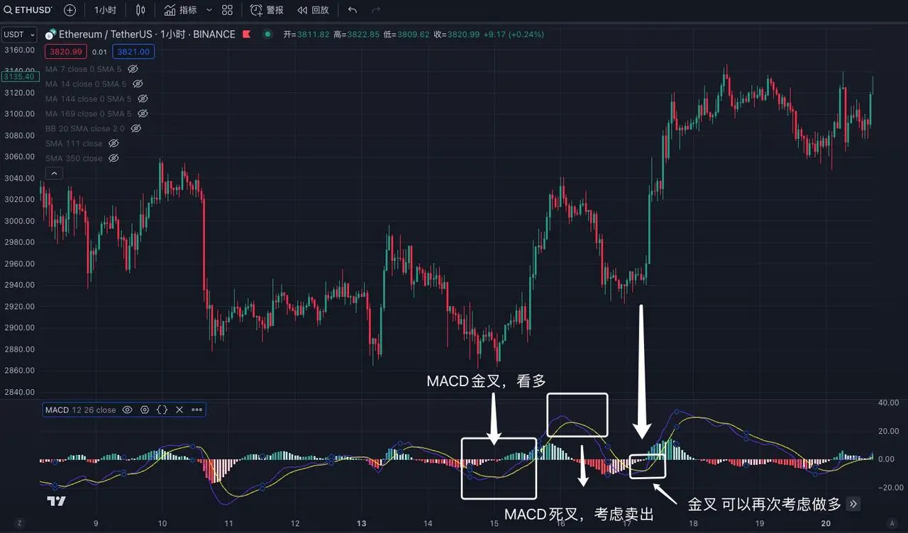
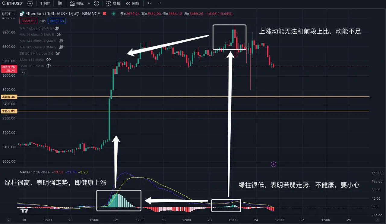
Taking the 4-hour trend of ETH as an example, when the MACD line crosses the signal line, it represents a bullish trend. When the signal line crosses the MACD line, it represents a bearish trend. Additionally, MACD is suitable for all time frames, whether long-term or short-term, whether it's the 1-minute or weekly time frame.
Advanced Use of MACD and MA
In addition to the basic use of MACD and MA, it is far from enough to just learn these. After all, these technical indicator usages can be found in public information, and many major players and institutions intentionally create "false trends" to make you think that if you don't buy now, you will miss out. In reality, this is just a trick to get you on board.
How to prevent and identify these "false trends"?
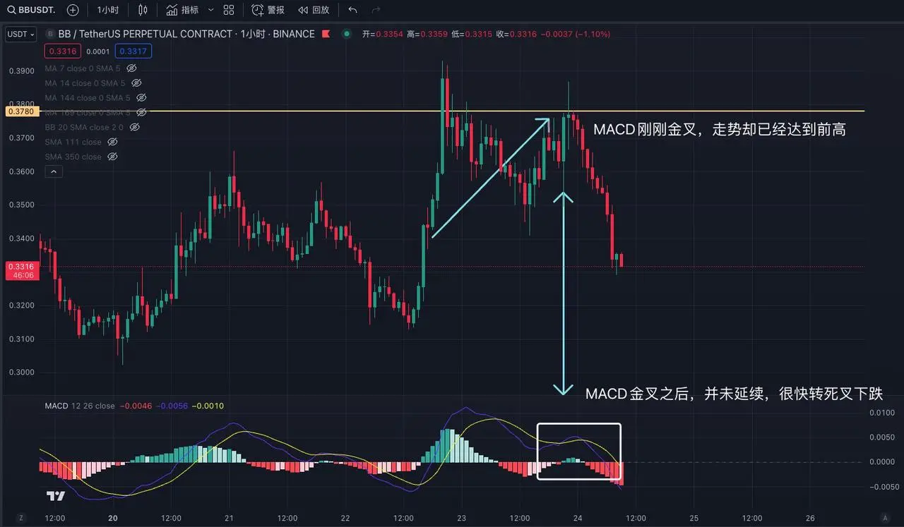
False trends are mainly guided by MACD golden crosses to lead novices into the market. Taking the 15-minute trend of BB as an example, when the 15-minute trend breaks through a new high and then quickly falls, and the MACD enters a death cross, it indicates the start of a pullback. However, during the pullback, the trend is quickly recovering, even approaching the previous high, but at this time, the MACD is just starting to form a golden cross. We can understand this kind of trend as "having the desire but lacking the ability," meaning the price has rebounded to the previous high, but the MACD has just formed a golden cross. More than 80% of such trends will end up like this, strong for a moment and then weak.
Continuing with the example of the 1-hour trend of ETH, when the MACD forms a golden cross and the green histogram rises significantly, the price follows the uptrend. This kind of rise is a high-quality increase, indicating that it is suitable to enter the market. Subsequently, the price enters a sideways adjustment phase, and the MACD turns into a death cross. After the adjustment, the MACD forms a golden cross, but it is observed that the increase in price and trend is not as strong as the previous golden cross, and the MACD histogram is not continuously strengthening. This "holding one's breath" state is very dangerous. Although the MACD forms a golden cross, the strength is not strong, and the longer this state continues, the more dangerous it becomes. When the price breaks through a new high but the MACD does not, we call it "bearish divergence," which is a strong sell signal. Similarly, when the price breaks through a new low but the MACD does not, we call it "bullish divergence," which is a buy signal.
II. Explanation and Application of BOLL and RSI Indicators
BOLL (Bollinger Bands)
BOLL was mainly designed by the American stock analyst John Bollinger based on the principle of standard deviation in statistics. I personally believe it is very useful in the secondary trading of blockchain. BOLL consists of three lines: upper band, middle band, and lower band. The upper, middle, and lower bands each have the meaning of resistance and support. When the price reaches the upper band of the Bollinger Bands, it may pull back due to resistance, and when it reaches the lower band, it may rebound due to support. When the stock price rises above the upper band of the Bollinger Bands, it indicates overbought conditions and a possible pullback. Conversely, when the stock price falls below the lower band, it indicates oversold conditions and a weak market. When the stock price falls from the upper band to the middle band, the middle band acts as support. If it falls below the middle band, it becomes a resistance level. When the stock price rises from the lower band to the middle band, it faces resistance. Breaking through the middle band and stabilizing indicates a change from resistance to support.
Here are 10 golden basic rules of Bollinger Bands, which are very important:
- Be cautious of a pullback when the price breaks out above the upper band.
- Be cautious of a rebound when the price falls out below the lower band.
- A strong trend is always above the middle band.
- A weak trend is always below the middle band.
- Narrowing upper and lower bands hide sudden changes.
- The wider the opening, the stronger the momentum.
- The middle band guides the trend direction.
- A sudden contraction of the channel indicates a reversal.
- A sudden expansion of the channel indicates no more consolidation.
- The longer the channel narrows, the smaller the contraction, and the more obvious and drastic the future changes.
Example explanation:
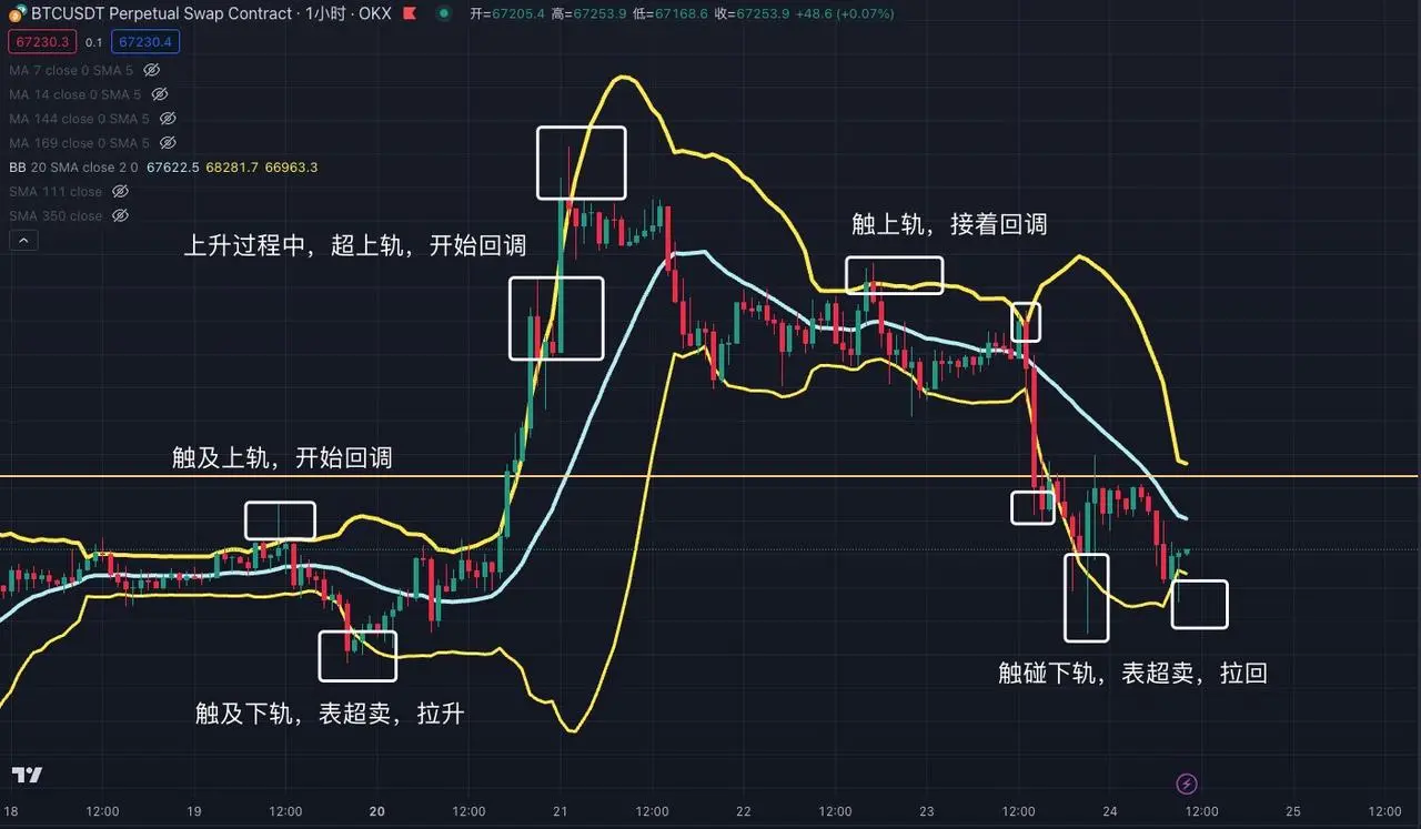
Taking the 1-hour trend of BTC as an example, BOLL is mainly divided into three lines: upper band, middle band, and lower band. When the price exceeds the upper band, it indicates overbought conditions and a high probability of a pullback. When the price falls below the lower band, it indicates oversold conditions and a high probability of a rebound.
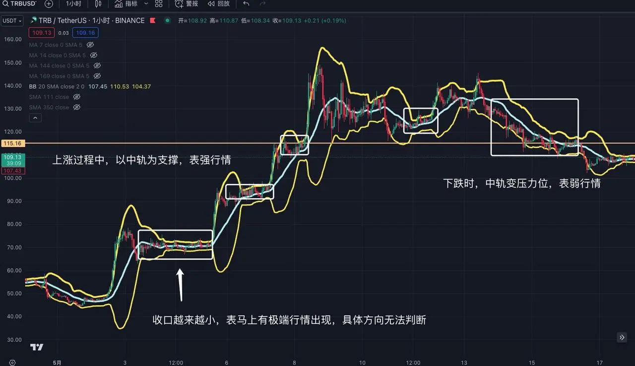
Continuing with the example of the 1-hour trend of TRB, when the Bollinger Bands narrow, it indicates that an extreme market trend is about to occur, but BOLL cannot accurately determine the specific direction and requires other indicators for assistance. The longer the narrowing time, the shorter the Bollinger Bands, indicating a more intense future market trend. In a strong uptrend, BOLL will gradually rise along the middle band, while in an extremely strong uptrend, BOLL will continue to rise above the upper band. Conversely, in a weak downtrend, BOLL will gradually fall along the middle band, at which point the middle band changes from a support level to a resistance level. In an extremely weak market, BOLL will continue to fall below the lower band.
RSI (Relative Strength Index)
RSI (Relative Strength Index) calculates the strength of market trends based on the magnitude of price changes and predicts the continuation or reversal of trends. The RSI value fluctuates between 0 and 100, meaning that prices will not exceed this range. In simple terms, when the RSI reaches 70, it indicates overbought conditions and an increased risk of a pullback, while when the RSI falls below 30, it indicates oversold conditions and a potential uptrend.
Example explanation:
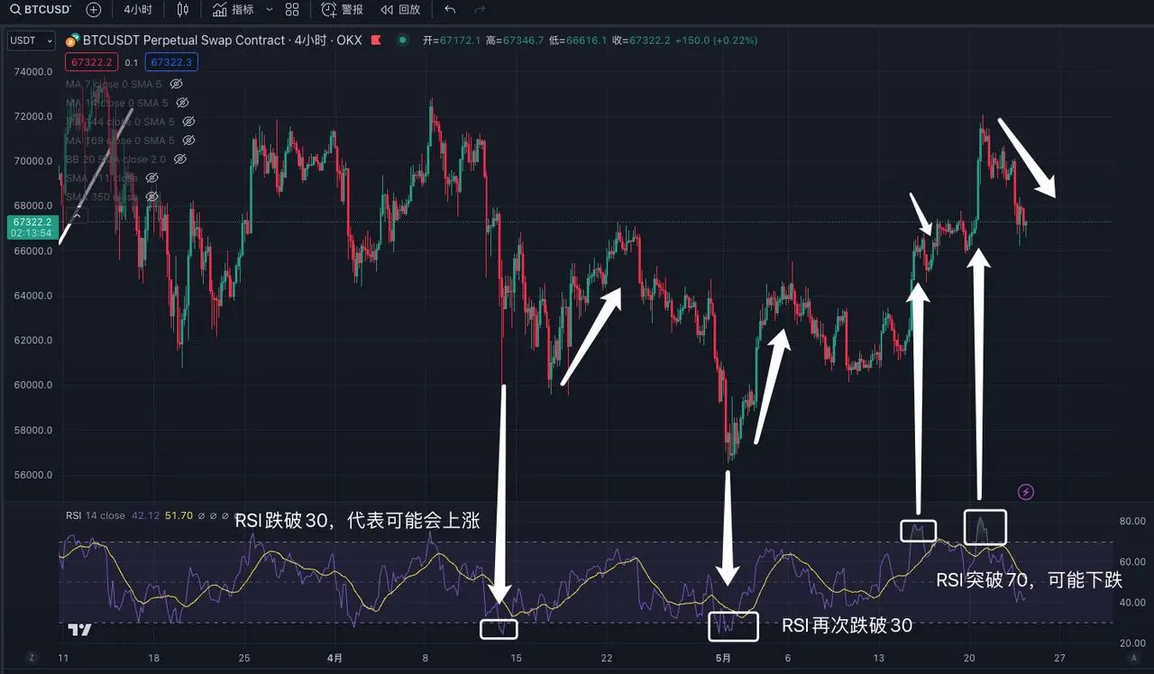
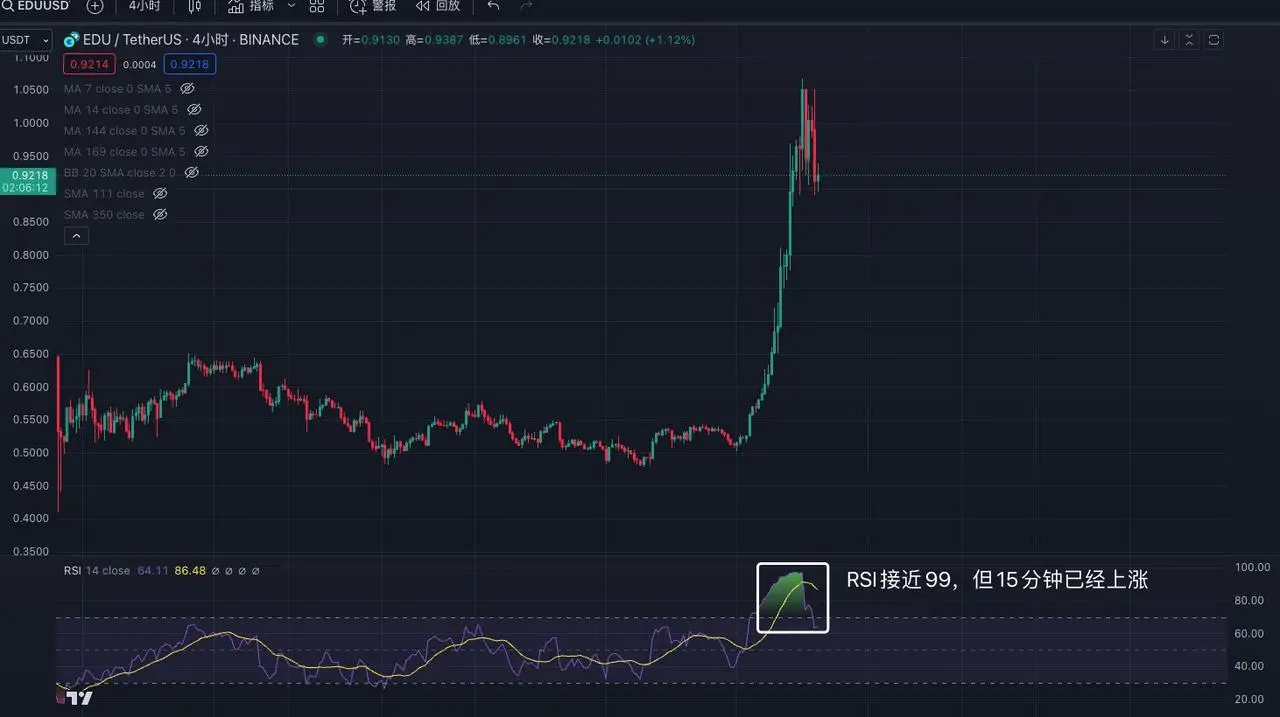
Taking the 1-hour trend of BTC as an example, when the RSI falls below 30, it indicates a sideways movement and a pullback, but this pullback is not absolute and only indicates a very weak market, and cannot be used as a direct buying basis. Similarly, when the RSI breaks through 70, it indicates overbought conditions and a potential risk of a pullback. However, this still cannot be used as a basis for buying and selling, only as an auxiliary judgment. Note: In extreme market conditions, RSI can reach 99 or 1, so do not rely solely on RSI as the main basis for judgment.
Continuing with the example of the 4-hour trend of EDU, after the RSI breaks through 70, it continues to rise, and the RSI eventually reaches 99. Therefore, we cannot use the method of buying at 30 and selling at 70. We need to judge the nature of the stock/cryptocurrency, whether it is a small-cap, meme-type cryptocurrency, or a high-control cryptocurrency. Compared to blue-chip cryptocurrencies, the RSI judgment for other small cryptocurrencies may need to be raised to the range of 90 and 10, rather than 30 and 70, and this needs to be judged by oneself.
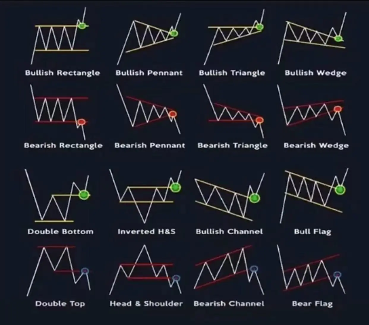
III. Variations of Flag Patterns
Flag patterns, also known as triangle patterns, are not indicators but rather trend changes based on the candlestick chart. We can summarize 16 common basic variations, and if a similar trend is observed, buying in generally has a high success rate, with a subsequent bullish outlook. However, there are also times when it fails. It is recommended to buy at the low point of the flag. When breaking through the triangle area to the upside, the breakthrough area becomes a support level, and it is advisable to enter near the support level during subsequent declines.
Example explanation:
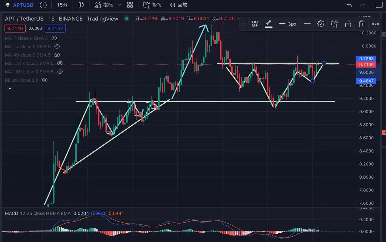
Taking the 15-minute trend of APT as an example, its trend closely replicates the third and tenth patterns shown in the above image. However, it is important to note that this is a successful case. Many major players and institutions intentionally create similar patterns to deceive people into entering the market. We need to be vigilant and consider implementing stop-loss measures in a timely manner.
Continuing with the example of the 1-hour trend of TRB, we observe that TRB has indeed utilized the trend of a three-week flag pattern, achieving a threefold increase in one week. Therefore, when we see similar trends in the market, we can draw them ourselves for verification.
IV. Conclusion
As the saying goes, in trading, one cannot lack in strategy, principles, or techniques. This report focuses solely on the "techniques" in the trading process. However, merely learning and mastering the use of technical indicators is far from sufficient. There are many pitfalls in the market, and the market trends, uptrends, and downtrend methods change significantly every three months or so. Therefore, it is necessary to continuously observe and summarize the subtle changes in the market.
People are dynamic, while indicators are static. The existence of technical indicators is to assist in judging trades after thorough understanding and risk control, and cannot be directly used for profit. After all, all technical indicators are lagging and cannot be 100% accurate. Only with sufficient understanding and risk control can they assist in investment; otherwise, it is gambling.
Furthermore, all technical indicators are not as simple as described in the report. Each indicator has different variations and methodologies. If studied carefully, each indicator can be studied for several years. Therefore, the article does not cover all variations and methodologies. Additionally, everyone has different trading styles, and the use of indicators varies accordingly, requiring gradual adjustments based on individual trading styles.
免责声明:本文章仅代表作者个人观点,不代表本平台的立场和观点。本文章仅供信息分享,不构成对任何人的任何投资建议。用户与作者之间的任何争议,与本平台无关。如网页中刊载的文章或图片涉及侵权,请提供相关的权利证明和身份证明发送邮件到support@aicoin.com,本平台相关工作人员将会进行核查。


